End of the Line

July 27, 2012

It’s not a sad day, but there is some sorrow to it.  Today we reach the end of the line.  Poor Richard’s Printshop is closing today.  And I guess it’s alright to use the name of the franchise now.  Most of you know that the shop was an Alphagraphics franchise in Macon, GA.

Poor Richard has found out that negotiating the end of a business is difficult.  I had high hopes of managing change and letting my customers know what was going on way ahead of time.  Alas, negotiations with prospective buyers precluded that.  The end has been a little messy.  I’ve left a few things hanging for the first time in nearly 14 years and I’m sure that a few of our customers are wondering a bit right now.

Every ending deserves an old Chinese proverb.  I believe that I actually heard one once that suggested a career change every 7 years. We made it almost twice that long and it is definitely  time for change.  What remains of the printing industry will be very different and Poor Richard doesn’t really regret opting out of the massive tectonic shift.

(If you’ve got Spotify on your computer, now’s the time to turn on Truckin’ by the Grateful Dead).

There are some good memories:

Of people we worked with:

  • Oscar, our first pressman, who went through life with Pantone Reflex blue on his nose.
  • Doug Titman, a fabulous artist, and wonderful designer who occasionally spent the night on our sofa.
  • Deresa, Carole, and Renee who stayed only a short time, but made life much richer.
  • Chris and Ricky, who contributed so much during the growth years.
  • Joe Middlebrooks – our 60 year old college intern, who didn’t leave until retirement.
  • Brian – right hand man until near the end. Good friend, I hope, for years to come.
  • Todd, Sharon, and Jamaal – who hung on until the very last. Just can’t tell you how much I appreciate that. Godspeed!
  • Jim Fidenza, Mike Boston, and Leo McDonald with Alphagraphics, Inc.; and Kirk Allen, who tried really hard to help as we approached the end of the line.
  • Our paper salesmen – Tracy, Tim, and John, who were there for us always.

Of Customers:

  • Celeste Murdock Mitchell – who placed the first order and received nearly the very last delivery.
  • Penny, Brandi, Jen, Janet, Kathy W., Steve, and Matt – the best designers in Middle Georgia.
  • Bright Ideas and HHB – Kathy, thanks for sticking with us so long.  Paige and Kendra, we loved working with y’all.
  • Barbara Barth – who was, and is, just really funny.  Have missed you the past year or so.
  • Charlene and Jim at Theatre Macon,  Beverly Ford and Mechel McKinley – the kindest people I know.
  • Jan, Ruth, Melanie, Marty, Chip, Tony, Amy, Patty, and so many others who came to us with projects year after year after year.

Of Events and Projects:

  • Keeping time year after year with Richard Austin and the Antioch Association of Primitive Baptists.  I just don’t know why it is that I’m aging so much faster than you!
  • Of Mercer projects that came regularly with due dates the week prior to the day the order was received, and how good it was to work with people who lived by their word.
  • Dealing with a strange fellow named Moti from NY who wanted to print bonds and currency for the Macon Money game. Thanks, Mechel, for keeping this one straight.
  • Moving the business to downtown Macon, without significantly disturbing the drunks in Poplar Street park. Macon, I wish you well!

Enough of that.  To our customers and friends, many thanks! What a long, strange trip it’s been.  Overall,  it was a good ride and I will miss working with many of you (and chuckle a little bit about the rest).  If you want to follow along, Poor Richard will be looking for a REAL JOB and will chronicle this in a new blog  at richardsalmanac.us.

Life is still grand!


Which end’s up?

March 8, 2012

ImageI came across this odd photo of a school bus in Google Images and felt like it was fairly representative of life during these past months . . . completely impossible to figure out which end should be up.

Actually Poor Richard was very surprised to see that some random readers still encounter this blog from time to time. I began this effort years ago with the intent of providing humor and occasional entertaining messages of relevance to Poor Richard’s business, an A__ha_ra_hi_s franchise. (I still can’t post the name in the blog, in abject fear of provoking the ire of Saruman in his minions, who reside in Orthanc, the ivory tower located in Utah or thereabouts.  But wait, that’s another story altogether, isn’t it?)

For the past few months, I’ve been following my mother’s admonition: if you don’t have something good to say, don’t say anything at all.  To assert that the printing business has changed is not just an understatement, it’s an offense against the obvious.  It would be lovely to offer that we’ve charted a new course and are off to grand adventures with a revitalized business.  Alas, that is not reality.  We have tried about everything with our little business in our little town, and very little has worked.  Today, we are struggling with a very small staff, battling deteriorating volumes and prices, losing lots of money, and praying for miracles.

The topsy-turvy bus is actually a good image for this post and these times.  The idealism of past years could be represented by the upside-down wheels on top.  We’re still driving the bottom half, which is anchored to the ground by gravity; but I’m wondering how long the tires and the engine will hold out.


Dogs and a kinder, gentler (and smarter) USPS

June 11, 2011

photo courtesy ABC News

In their relationships with the United States Postal Service, dogs generally have the upper hand . . . er, paw.  Beyond the fact that postal employees frequently provide a tasty midday snack for their customers’ canines (see photo above), the USPS’s attitude toward four-legged fuzzballs has been surprisingly favorable.  Dogs have been featured frequently on stamps, some postal employees actually own and love dogs, and recently a new USPS program has helped to locate a lost Labrador in Stillwater, NY.

Here’s the story:

When Randi Slocum’s dog Kaylee ran away from her Stillwater, NY, home, Slocum and her friends did what any group of concerned pet owners would do — they formed a search party and knocked on neighbors’ doors looking for the chocolate Labrador mix.

But Randi’s mother, Carolyn, had a better idea — use Every Door Direct Mail (EDDM) to notify residents in Stillwater and nearby Schuylerville, NY, of the dog’s disappearance.

Carolyn Slocum, a board member of the local Postal Customer Council, had just attended an EDDM seminar given by Albany District Grow Your Business Coordinator Natalie Dolan. “I knew that the best way to reach every household was through the new EDDM program,” said Slocum. “Since many people work all day, this would be the most likely way to reach them.”

By the next morning, Carolyn had the mailings prepared to EDDM standards and dropped them off at the Stillwater and Schuylerville Post Offices. The flyer helped unleash a series of phone calls, and that helped lead to Kaylee’s safe return.

Source: Postal Reporter News Blog

Long the poster child for government (or quasi-government) inefficiency, the USPS has in recent months introduced a couple of programs that are surprisingly sharp.  Every Door Direct Mail (EDDM) is simply not what you would expect from an agency know for volumes of arcane rules.  The postal service calls it a simplified mailing process, and it really is. Basically, EDDM makes it easy to send saturation mailings to reasonably small geographic areas without the need to purchase address lists. EDDM comes in two flavors – regular, for mailing service providers like Gralpharaphics Macon (name disguised to protect the delicate sensibilities of the franchise) and retail, for the DIYer.  The website (https://smp.usps.gov/) is functional and includes a cool mapping feature to allow the user to select by postal carrier route.

Source: USPS

It is important to note that EDDM is the direct opposite of the targeted mailings that Poor Richard’s printshop has been promoting for some time.  EDDM is, in essence, a saturation mailing. No demographics selections are available and because the addressing is generic, it’s not possible to personalize the mailing or direct the recipient to a personalized URL (PURL).  The only select feature allows the sender to de-select business addresses and/or P.O. boxes.

Even with those limitations, EDDM will be great for service businesses and other small businesses that sell to a broad customer base and want to target specific neighborhoods to generate new business.   We are currently working on a saturation mailing in three neighborhoods for a startup lawn service business.  He’s chosen carrier routes where there are few apartment complexes and has eliminated business addresses.  The mailing will be around 1700 pieces, postage will be around $.15 each,  and most of the mailpieces will land at addresses that could conceivably benefit from his services.
On the other side of the mailing spectrum, the USPS has introduced a special discount to run in July and August 2011 to help promote “web-enabled” mailings.  This is another smart move that recognizes the value of cross-channel marketing and the integration of direct mail and internet.  First Class and Standard Mail letters that incorporate a QR or other mobile barcode will receive an additional 3% discount during July and August.  Details can be found on the  USPS website.

Both the US Postal Service and the printing industry as a whole have suffered greatly during the past almost 4 years of decession as cost cutting, business closures, and an accelerated shift to online communication have reduced volumes.  Poor Richard is hoping that the tide may turn again as marketers recognize the value of tangible print messages, especially in combination with impressions from other channels.  It is refreshing to see the USPS taking some intelligent direct action to encourage the use of both direct mail and cross channel efforts.  Want to try any of this out?  Call me or stop by the printshop behind the red awnings on Poplar Street. Bring your dog.


Let’s have some resolution, please

April 23, 2011

Nope, it’s not what you think.  This entry’s not going to be about Congress or any other assembly of wishy-washy, slimy political creatures. That’s not the lack or resolution that concerns Poor Richard today. It’s a different lack of resolution . . . image resolution.

It’s been a while since I’ve approached anything even moderately technical. Honestly, I’m almost convinced that there’s no one out there who really gives a flip about the finer points of the printing art. This topic’s pretty basic, though, and has major implications for the quality of any printed piece.  It’s like this: you can’t take a bad steak and cook it on a good grill and make it a good steak.  The quality of the grill has nothing to do with the quality of the meat.

The same occurs with images plucked from the internet.  And it is a shame, because the images are so, so readily available. Our customers just can’t resist them . . . and then they get upset with us when we tell them that the images won’t work.  One more time . . . images plucked from the internet will rarely work for print.

Why?

cross-eyed girl

Let’s take a look at this freckle-faced, cross-eyed girl.  She’s cute, isn’t she?  Poor Richard plucked this picture from one of the image libraries to which he subscribes.  It was downloaded at 300 dpi, the optimum resolution for print.  That means 300 dots per inch.  To oversimplify a little, when we convert an image for printing, the information is carried in dots.  When we print, we’re actually putting dots on paper.  When you look at a printed piece of paper, your eyes and your brain are fooled into thinking that you’re seeing a whole spectrum of color, instead of a bunch of dots. When you print a photograph on paper using 300 dots per inch, it looks pretty good.

Now, let’s make it a little more complicated.  When we’re talking about digital images, the dots are really pixels.  Now a pixel is more of an electronic term than a printing term.  When you’re looking at your computer screen, the color images you see are comprised of pixels, little dots with varying intensities which fool your eyes and your brain into thinking that you’re seeing a whole spectrum of color, instead of a bunch of hyperactive dots.  Because of the way your computer screen works, fewer dots are needed to fool your brain than on paper.  In fact 72 or 96 dots per inch works pretty well.

If you spread the dots out, the picture gets bigger.  The cross-eyed girl above is roughly 4.7 x 7 inches at 300 dpi.  Measured in pixels, that’s 1414 x 2121 pixels. Because your computer screen measures something like 1024 x 768 pixels, the photo is actually too big for the screen.  If we spread the crosseyed girl’s dots out for the computer screen, she can be as big as 19.6 x 29.5 inches.  So, we can lose some dots (downsize the image) she’ll still look cute on the internet.  Plus, the file size is smaller, which means she’ll appear on the screen faster.

Image areas

Let’s look at it a little bit differently.  We’ll draw a couple of boxes over the little girl’s nose.  The light blue box represents 1 square inch at 300 dots/inch.  The green box represents 1 square inch at 72 dpi.  Here’s the point:  there’s a lot more information in the blue box. In fact, there’s enough dots there to describe a whole nose, an upper lip, and a bunch of freckles.  In the green box, all you get are the freckles.

To take things a little further, I can certainly lose some of the information from the blue box and the nose will still look good on screen.  But I can’t get more information into the green box.  The simple explanation is that if I increase the size of the green box, I basically just make the dots bigger.  Actually, it doesn’t really work that way, but the effect is the same.

One eye

Ok, so let’s just look at an eye.  If we only look at one of them, they don’t look crossed, but that doesn’t have anything to do with resolution.  Let’s assume that we’ve sized this picture for the screen at 72 dpi.  That means that if the size of the eye was 1″ on screen, it would measure 72 x 72. Basically, we’ve moved the green box over the little girl’s eye and captured that image.

eye at 72 x 72

This is the eye at 72 x 72.  The eye above will give you a better idea of clarity. It looks okay on your computer screen, right?

What if we want to print the eye?  To get the information needed for a clear print, we need the dots to be closer together.  If we move theme close enough to get 300 dots per inch, the size of the image shrinks.  In fact, it shrinks to about 1/4 inch, probably a little small for anyone to notice, even if the image does print clearly:  reduced from internet

But, if we try to increase the size, things just get worse.  Because we can’t really increase the information, we just stretch the dots and the image becomes blurry.  This is essentially what happens when a photo intended for the internet is used for print.  The resolution isn’t adequate and it blurs out.  Depending on the image, edges can become jagged, and you might see pixelization (boxes) in the image.  The photo will look crummy and embarrass your printer, who is supposed to know better.

The last question: Can’t you fix it with Photoshop?

Yes and no. Photoshop and other photo editing programs use interpolation algorithms that basically multiply dots instead of stretch them.  These formulas can gauge the variations of color in a line or  radius from the dot that is being multiplied and actually create gradients or ranges of color rather than exact duplicates of the dots being multiplied.  This can certainly help if it is absolutely necessary to enlarge an image, but the process is an educated guessing game.  The image editing programs guess what information might be there, and the results can be unpredictable and inconsistent.

Synopsis and conclusion

Downsizing is ok. You can always make a big photo smaller.

Upsizing isn’t. The bad steak and good grill aphorism applies.

Listen to your printer.  Sometimes, we really do know what we’re talking about.


Inspired . . . Really!

March 8, 2011

This one was published in the venerable Macon Telegraph, so it really has to be true. (For real, see the article).  It seems that the Pork Board, ummh make that the National Pork Board, has decided that it’s time to change their careworn slogan of 25 years.  You’ve heard the old tagline, even if you don’t remember it:  “Pork:  the other white meat.” That one never really played well down here. The first white meat is naturally chicken.  In Middle Georgia, we always figured the other white meat was catfish.

So, anyway, with pork consumption totaling 50 pounds per capita in the U.S.; the National Pork Board wants to increase consumption by 10% by 2014.  And they’re going to do it with “a stronger connection, a more emotional connection to our product,” This according to Ceci Snyder, the board’s VP of Marketing.  Tying all of this together is a new and powerful new slogan.  Are you ready for this?

Pork: 

Be Inspired


Pig in a tutu

The pig in a tutu doesn’t come with the new catchphrase . . . it’s Poor Richard’s contribution, just for effect.  I don’t know about the rest of you, but this one really gets my adrenaline pumping.  I’m picturing a big budget, highly paid advertising executives, focus groups, quantitative analysis, A-level meetings with upper management, large expenditures, lots of money . . . all surrounding the impressive new phrase: Be inspired. Oh, and did I mention lots of money?

Poor Richard used to travel through southern Indiana, where they talk about hogs and actually raise them.  I expect that a small agency in Vincennes or Seymour could have done the same work for $500.  Nonetheless, I am impressed (and inspired). In fact, I’m so inspired that I’m going to start on this year’s 55 pounds of pork tomorrow.  Barbecue for lunch at Gralpharaphics!

Dirty Pig Face


So what works?

January 12, 2011
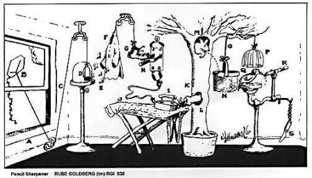
Rube Goldberg's Pencil Sharpener

There's nothing like simplicity

You’ve just got to love Rube Goldberg.  In the cartoon above, the object is to sharpen a pencil.  This is accomplished by flying a kite. The kite string is attached to a birdcage. As the kite ascends, the birdcage door is opened, releasing the birds who fly into a jacket, lowering a boot by means of a fulcrum that then activates a switch providing electricity to an iron.  I assume that the iron produces steam, which scares the squirrel through the bottom hole in the hollow tree.  When he reaches the top hole, he launches an acorn into a basket, thus activating another fulcrum that raises the cage above a large bird, enabling it to eat from a feeder intricately connected to a sharp knife.  The motion of the bird at the feeder causes the knife to whittle a sharp point on the pencil.  Clever, huh?

This morning, I was asked by one of our folks to explain how this whole “marketing services provider” thing works.  More specifically, I was asked how we were going to sell it.  It struck me that before we go about selling a set of services, it would probably be useful to define them. So I began thinking about what we can do for a customer who wants to sell more ummh . . . pencil sharpeners.  First, we could set up a WordPress CMS site for a small business and incorporate a blog,  an online storefront, and an event calendar. We could print and mail personalized postcards with PURLs for them advertising the storefront and providing an incentive to subscribe to their E-newsletter, which would be set up using a totally ‘nother service.  Then we could help them develop and manage a  database of potential customers who might shop at their online storefront or even conceivably show up at their place of business. As the database increases in size, we could actually take a survey to find out what all of the customers and potential customers think about the website, the storefront, the blog, the e-newsletter and the PURLs. AND we could set up social networking on Facebook, Twitter, and LinkedIn to further enhance the breadth and impact of their communications efforts.  PLUS we’ll put QR codes on everything . . . just because we can.

Sounds kind of like a Rube Goldberg device, doesn’t it?  What we all innately know is that some things work and some things don’t.  What we all don’t innately know is when some things will work and how they will work and how long they will keep working.  This is the truth, no matter what Seth Godin or the latest marketing guru may say.  Marketing, especially for small businesses, is not exactly trial and error, but it really is at best an intelligent guess.  Poor Richard knows this from his experience as a small businessman and a marketer.  (Fer’ instance, a year and a half ago Facebook ads worked pretty dang well for the printshop behind the red awnings on Poplar Street (name assiduously camoflaged from the franchise, who is totally embarrassed by Poor Richard’s blog).  A Facebook ad could generate a phone call or two or three pretty quickly . . . and yes, it generated “friends” and likes on our Facebook Page.  (Poor Richard maintains that friends, likes, and clicks don’t count for much if they don’t sell anything.)  Don’t know what happened, but Facebook changed  around June last year . . . since then zilch.)

Note: Please pardon me for the encapsulated parenthetical phrases. Poor Richard’s sixth grade English teacher, Miss Birch, is rolling in her grave.

But that’s really the crux of it, isn’t it? All of this messing around with technology doesn’t really mean much if it doesn’t sell anything.  My next door neighbor applied a torque wrench to my level of frustration yesterday with a story about “saving money with technology.”  They are planning for a trade show and had considered revising and reprinting their catalog.  This is a major project for the company and not one that Poor Richard’s Printshop would take on, but the story irritated me just the same.  Someone discovered that information could be conveyed on an iPad; so rather than produce a tangible printed product that could be given to prospective customers, they decided they’d just show ’em stuff on the iPad.  They spent $1,000 on gadgets, rather than $10,000 on print.

Got to dig into this a little bit to make sense of it:

  1. Was the decision not to spend $10,000 on a big catalog wrong? Maybe not . . . it’s a lot of money and plenty of those catalogs would get tossed.
  2. Do the iPads really replace the catalogs?  Absolutely not . . . whizbang toy that no one would remember unless you gave them one (and then you’re spending way more than $10,000 at the tradeshow).
  3. Was there an opportunity lost?  To quote the megolamaniacal ex-governor of Alaska, “you betcha.”  A printed piece goes into the sack and at the very least provides a reminder when the potiential customer gets home.  The sack stuffer doesn’t have to be a full blown catalog.  A one page flyer might do perfectly well.
  4. What else? The real opportunity for the iPad is collection of data.  While my neighbors are showing  stuff on the cool, new gadget; they could also get names addresses and particular needs that let them get back in touch with the prospect later on.

Will it work?  Poor Richard doesn’t think so.

Trying to help our customers with “marketing services” or “marketing campaigns” really comes down to what works.  There’s no way that we’re going to bat 1,000.  Flying a kite is probably not the best way to start the process of sharpening a pencil and throwing the whole arsenal of acronyms at a customer who just wants to sell something is equally ridiculous.  So what’s the answer? Selling “marketing services” and implementing “marketing campaigns” really has more to do with knowing what to try than anything else.  What is the goal? What is the budget? What makes sense to try? How do we measure it? What do we do next? These are the questions that really mean something and the substance of the conversations we should have with our customers.

So what does work? We don’t have to build a Rube Goldberg pencil sharpener just because we’ve got a bunch of birdcages and a roll of kite string.  It might be better just to whittle the end of the pencil with a pocketknife. Let’s try it.


All dressed up with no place to go?

January 10, 2011

It’s been a rare, snowy day here in Middle Georgia.  To be more precise, it’s been a rare, icy, slippery day here in Middle GA. Couldn’t get to the printshop this morning and received no disappointment whatsoever when I contacted the team and asked if they thought we should call off work for today.

“There’s a half inch sheet of ice out my front door.” reported designer Todd.

“I’m at my girlfriend’s house and we’ve already built a fire.” from RH man Brian.

“I was all dressed and ready to go at 6:00 am when you texted that you weren’t coming.” from the first lady of sales, Sharon.

That one held me up. It brought to mind the lyrics of one of my favorite British Invasion songs, “I ain’t got you:”

I got a Maserati G.T.
With snakeskin upholstery.
I got a charge account at Goldblatt’s,
But I ain’t got you.

I got a closet full of clothes,
But no matter where it goes,
It keeps a ring in the nose,
But I ain’t got you.

I got a tavern and a liquor store.
I play the numbers, yeah, four forty-four.
I got a mojo, yeah, don’t you know,
I’m all dressed up with no place to go.

I got women to the right of me.
I got women to the left of me.
I got women all around me,
But I ain’t got you.
No, I ain’t got you.

For those of you who might be somewhat beyond the age where familiarity with the British Invasion is a given, the Yardbirds were the Rolling Stones that didn’t stay around.  They had three great guitarists.  Jimmy Page went on to lead Led Zeppelin. Jeff Beck produced one of the most amazing jazz fusion guitar albums of the 1970s (Wired). And then there was Clapton, the guitarist of the aforementioned number. Poor Richard doesn’t ascribe to the 1960’s graffiti asserting that “Clapton is God,” but it’s fair to assume that you have heard of him.

Ain’t got you . . .  sounds really familiar. The printshop behind the red awnings on Poplar (name carefully concealed to protect the sensitive interests of the franchise) has spent a great deal of time and energy over the past couple of years adding the latest whizbang capabilities. We can help customers with email communications.  We can send postcards with PURLS. We can help with social networking and Google Adwords. We can even develop simple CMS sites for small businesses.  All of that along with wonderful capabilities in digital and conventional print and you’d think that we’d find an interested customer or two. But in reality, we’re kind of stuck . . . all dressed up with no place to go.

Poor Richard has batted about the “marketing services provider” concept for a couple of years. This theory maintains that in order to survive, printing companies must diversify into other realms of communication and become marketing consultants to their customers.  I’m all for the first part of the assertion.  Conventional print is certainly waning at the moment and merging conventional print capabilities with the low cost potential of the internet only makes sense.   Marketing strategy is something completely different, though, especially in the altered reality of the Great Decession.

If you had asked me just a couple of years ago, I would have said that marketing strategy was the exclusive purview of the experts.  In those days, marketing was at least partially predictable . . . traditional efforts (advertising, PR, etc.)would yield predictable results. Now I’d say it’s anyone’s guess. Proven tactics may fail totally and a low cost video on YouTube can go viral. It’s unpredictable, but there’s plenty of stuff to try.

Our Gralpharaphics shop has experienced good business relationships with a couple of excellent agencies, and in balance, these folks have done a very good job for their customers.  One of our key agency accounts closed last year after trying very hard to bring their customers in line with the new realities of marketing.  They experienced difficulties because the new realities are damnably hard to define and their customers still expected the predictability of the old paradigm.

So where does that leave us? We can implement some pretty cool stuff, if we can find the customers willing to take the risk.  These folks are pretty hard to find in icebound Middle Georgia, though, so Poor Richard is humming the old British Invasion song

Couldn’t find a good Yardbirds video, but the audio tells the story  . . .

Got to end on an optimistic note, though. Here’s Janis . . .


Counterintuitive

December 12, 2010

Always have liked that word.  Something that is counterintuitive is unexpected, surprising. Counterintuitive results may even seem illogical at first.  A counterintuitive conclusion calls out for examination.

Where exactly is this leading? To something relevant, of course. International Paper Company has sponsored a new website based upon a seemingly counterintuitive argument.  The website is GoPaperGrowTrees.com and the argument goes something like this: choosing and using paper actually benefits forests and the environment.

Poor Richard can hear what may of you are thinking . . . “sheer propaganda from wealthy timber barons bent on despoiling America’s valuable natural resources.”

Admittedly, the source of the argument lends a certain tinge to it’s credibility. Poor Richard, having earned his livelihood (for better and lately for worse) in and around the timber and paper industry, may also be considered a suspicious source.  Yet the argument stands on its own, despite the advocates involved.  It’s born of simple economics and goes something like this:

  1. Forestry is an agricultural business.  This is certainly true in the US and the website supplies the data to prove it.
  2. The amount of a product supplied is directly related to the demand for that product. This is basic economics. Remember the S&D graph in Econ 101?  The price of the product is determined by the intersection of the supply and demand curves.
  3. There is competition for the resources needed for production.  In this case, the competing interest is development.  Most of the timberland lost in the US during the last 20 years was forestland that was eliminated for development. The value of the land resource was greater when developed for commercial or residential use than when employed in agricultural production of timber.
  4. If the demand for forest related products (specifically paper) remains low, prices will not provide an incentive for continued forest management, additional forest lands will be lost, and fewer remaining forests will be managed either for environmental or agricultural benefit.
  5. Finally (and conversely), an increase in the demand for (and price of) print and paper will preserve forest lands and help to insure the best economic and environmental outcomes.

Multiple factors have driven the decrease in the demand for paper and print during the last 3 years.  Foremost among these are the availability of competing technologies (like blogs on the internet), the perception that the cost of print outweighs any benefit it has over competing forms of communication, and the propensity to simply cut the larger identifiable costs when under economic stress.

It would be interesting to be able to measure the actual effect that environmental objections have had on demand.  While Poor Richard suspects that this would be difficult to quantify, there is no doubt that the green objection has made a great excuse for the denigration of print and the diminution of demand for print on paper.  (I still don’t believe that people are really freaking out about printing their emails).

Go Paper Grow Trees LogoWill this signal a return to the good old days of print on paper? Probably not, but it’s still a very effective (if counterintuitive) argument for valuable products that really shouldn’t be as outmoded as popular environmental mantras would make them.   Click on the logo, visit the site, watch the video and let me know what you think. Or better yet, order something printed on paper from the printshop behind the red awnings on Poplar Street.


Rumination

October 22, 2010

Sometimes we get too busy to ask the why questions.  We just swallow all that’s in front of us, without digesting, and go on along with the whatever that we have to deal with at the time.

I like Chik-fil-A.  There’s a lot to be said for cows and they do make great chicken sandwich advocates. There might also be something in their digestive systems that’s worthy of investigation. Rumination . . . chewing the cud. Cow’s swallow it first, then chew it up later before finally digesting it.

“Gross” would be the response of my 14 year old daughter, Madeline; and she may well be right.  After the grass is consumed, why bring it back up for re-examination? Even if there’s something to be learned, the whole process seems just a little . . . ummmh, nauseating?

Nonetheless, here we go . . .

Poor Richard’s Printshop (formerly something like Gralphagraphics before the franchise became incensed at his blog) has been reasonably busy since late August. At least, it feels busy because there are only a few of us to get the work out the doors and we’re all working very hard. I’m very thankful for this and appreciative especially of the customers who have stuck with us through all of  the “recent unpleasantness.”

It’s a little hard to put my finger on it, but there’s something about the work we’re getting that’s just different.  As an example, we printed 50 football program books this week just in time for the last game of the regular season. Football programs used to be a big deal . . . large saddle stitched booklets with lots of ads printed in decent runs in time for the first game of the season. This one was thrown together as an afterthought, perhaps to keep the businesses who purchased ads from asking for their money back?

Two weeks ago, we printed a very nice invitation for a health care customer.  Expensive paper, process color, good press run, scored and folded, tabbed 3 times to meet USPS specs and mailed at the very last minute, probably a week later than optimum to reach the target audience.

We have an end of the fiscal year audit booklet in-house for a municipality whose fiscal year ended June 30. We thought the book was due by September 30. It’s been stuck in our hold bin for over 2 weeks, waiting on revisions from the customer.

And then there are the envelopes printed for a communications company in a hurry, that have been sitting on the shelf waiting for pickup since October 5; the business card design for the new company that had their grand opening scheduled for October 11; and the display board and banner stand that actually did get designed, proofed, completed and shipped in 5 working days, thanks to UPS Second Day Air and our very good tradeshow exhibit supplier.

Actually, it’s not hard to identify what’s happening at all. It’s busy, but it’s not normal and Poor Richard’s stomach is a little upset.  We are reacting to our customers’ lack of planning and in some cases we’re getting burned and in some cases they’re getting burned, which is worse. (It’s worse mainly because we might take the blame.)

Our customers are firing before they aim. This is probably better for us than when they don’t fire at all, but I think there might be a better way.  It’s something to ruminate about . . .


What we think we know

September 25, 2010

It’s a bit surprising to start writing with a preconceived notion of the topic and then wind up with a conclusion totally opposite from the preconception held at the beginning.  You all have heard the old saw . . . assume only makes an ass of you and me. Presume  does the same thing. Sometimes presumptions and assumptions need examination . . . we don’t always know what we think we know.

Poor Richard worked all day in the shop last Sunday and hopefully won’t burn in hell for dereliction of church attendance, not that there aren’t other just causes for the same unfortunate end. While there, I had the radio tuned to NPR, usually my station of choice. They’ve renamed their Sunday AM commentary. It used to be  Speaking of Faith. Now it’s Being.  Being is a broader, more all-encompassing word that apparently validates the inclusion of all types of abstraction that push the envelope way beyond what normal listeners would consider discussions of faith, ethics, or other definable or at least potentially constrainable topics.

Last Sunday’s broadcast featured Joanna Macy, who was introduced as a “philosopher of ecology, Buddhist scholar and translator of the works of German poet Rainer Maria Rilke.” Ms. Macy is without doubt a fascinating woman with amazing life experiences. She was a Fulbright scholar, worked for the CIA in postwar Germany, with the Peace Corps in India and occupied the Seabrook nuclear reactor before it could open.  She is now 81, amazingly lucid, if somewhat adrift of the main waterways.

When I started writing this, I was prepared to go off on a diatribe about the misuse of language and the ever popular presumption that by eloquently stringing words together meaning is created (whether anyone understands it or not). Upon first listening, much of the interview with Ms. Macy seemed nonsensical, even bordering on lunatic.  It’s certainly out there.  Here’s an excerpt:

And that had a great spiritual teaching for me too, Krista, because it led me into fascination, if not obsession — I’ll say obsession — with long-term radioactive contamination through our processes of making weapons and generating power that insisted that I open my mind to reaches of time that had stretched both my heart and my intellect. In other words, I realized that we were, through technology, having consequences with our decisions — our decisions had consequences or a karma, as we could say, that reached into geological time. And that what in industry and government choices that we make under pressure for profit or bureaucratic whatever, that we are making choices that will affect whether beings thousands of generations from now will be able to be born sound of mind and body.

All this to say that there are long-term environmental implications from our decisions.  And there are other equally obtuse passages in the interview. After reviewing the transcript, though, I also find something quite different. There are jewels of wisdom in this conversation, insights from a person who has truly lived 81 years. Here’s one:

The biggest gift you can give is to be absolutely present, and when you’re worrying about whether you’re hopeful or hopeless or pessimistic or optimistic, who cares? The main thing is that you’re showing up, that you’re here and that you’re finding ever more capacity to love this world because it will not be healed without that.

I have a very Christian friend who has made almost the same statement when speaking of Jesus’ command to “love one another.” He says that the most active expression of love is simply showing up, being engaged.

Ms. Macy provides another optimistic insight regarding the clarity of thinking of a younger generation:

and they’re able to look into the face of some pretty awful political corrupt machinations or what have you that would get me frothing with righteous indignation and they smile and shrug and say, “What do you expect?” and then they go and do what needs to be done.

That’s refreshing, although it’s upsetting that my generation is at the root of the corruption that the next generations are coping with.  Perhaps in doing what needs to be done, they can unravel some of the snarled up mess that we’ve created.

Finally,  there’s the poetry.  Poor Richard is no student of poetry, but I found one of the verses compelling. Here it is:

God speaks to each of us as he makes us,
then walks with us silently out of the night.

These are the words we dimly hear:

You, sent out beyond your recall,
go to the limits of your longing.
Embody me.

Flare up like flame
and make big shadows I can move in.

Let everything happen to you: beauty and terror.
Just keep going. No feeling is final.
Don’t let yourself lose me.

Nearby is the country they call life.
You will know it by its seriousness

Give me your hand.

-from the Book of Hours, Rainer Maria Rilke

A wonderful anthem for an engaged life.  Sometimes it’s good for one’s presumptions to be disrupted. This is when we learn that our preconceptions, what we think we know, may be neither as accurate or profound as we once thought.  Read the transcript.