Let’s have some resolution, please

April 23, 2011

Nope, it’s not what you think.  This entry’s not going to be about Congress or any other assembly of wishy-washy, slimy political creatures. That’s not the lack or resolution that concerns Poor Richard today. It’s a different lack of resolution . . . image resolution.

It’s been a while since I’ve approached anything even moderately technical. Honestly, I’m almost convinced that there’s no one out there who really gives a flip about the finer points of the printing art. This topic’s pretty basic, though, and has major implications for the quality of any printed piece.  It’s like this: you can’t take a bad steak and cook it on a good grill and make it a good steak.  The quality of the grill has nothing to do with the quality of the meat.

The same occurs with images plucked from the internet.  And it is a shame, because the images are so, so readily available. Our customers just can’t resist them . . . and then they get upset with us when we tell them that the images won’t work.  One more time . . . images plucked from the internet will rarely work for print.

Why?

cross-eyed girl

Let’s take a look at this freckle-faced, cross-eyed girl.  She’s cute, isn’t she?  Poor Richard plucked this picture from one of the image libraries to which he subscribes.  It was downloaded at 300 dpi, the optimum resolution for print.  That means 300 dots per inch.  To oversimplify a little, when we convert an image for printing, the information is carried in dots.  When we print, we’re actually putting dots on paper.  When you look at a printed piece of paper, your eyes and your brain are fooled into thinking that you’re seeing a whole spectrum of color, instead of a bunch of dots. When you print a photograph on paper using 300 dots per inch, it looks pretty good.

Now, let’s make it a little more complicated.  When we’re talking about digital images, the dots are really pixels.  Now a pixel is more of an electronic term than a printing term.  When you’re looking at your computer screen, the color images you see are comprised of pixels, little dots with varying intensities which fool your eyes and your brain into thinking that you’re seeing a whole spectrum of color, instead of a bunch of hyperactive dots.  Because of the way your computer screen works, fewer dots are needed to fool your brain than on paper.  In fact 72 or 96 dots per inch works pretty well.

If you spread the dots out, the picture gets bigger.  The cross-eyed girl above is roughly 4.7 x 7 inches at 300 dpi.  Measured in pixels, that’s 1414 x 2121 pixels. Because your computer screen measures something like 1024 x 768 pixels, the photo is actually too big for the screen.  If we spread the crosseyed girl’s dots out for the computer screen, she can be as big as 19.6 x 29.5 inches.  So, we can lose some dots (downsize the image) she’ll still look cute on the internet.  Plus, the file size is smaller, which means she’ll appear on the screen faster.

Image areas

Let’s look at it a little bit differently.  We’ll draw a couple of boxes over the little girl’s nose.  The light blue box represents 1 square inch at 300 dots/inch.  The green box represents 1 square inch at 72 dpi.  Here’s the point:  there’s a lot more information in the blue box. In fact, there’s enough dots there to describe a whole nose, an upper lip, and a bunch of freckles.  In the green box, all you get are the freckles.

To take things a little further, I can certainly lose some of the information from the blue box and the nose will still look good on screen.  But I can’t get more information into the green box.  The simple explanation is that if I increase the size of the green box, I basically just make the dots bigger.  Actually, it doesn’t really work that way, but the effect is the same.

One eye

Ok, so let’s just look at an eye.  If we only look at one of them, they don’t look crossed, but that doesn’t have anything to do with resolution.  Let’s assume that we’ve sized this picture for the screen at 72 dpi.  That means that if the size of the eye was 1″ on screen, it would measure 72 x 72. Basically, we’ve moved the green box over the little girl’s eye and captured that image.

eye at 72 x 72

This is the eye at 72 x 72.  The eye above will give you a better idea of clarity. It looks okay on your computer screen, right?

What if we want to print the eye?  To get the information needed for a clear print, we need the dots to be closer together.  If we move theme close enough to get 300 dots per inch, the size of the image shrinks.  In fact, it shrinks to about 1/4 inch, probably a little small for anyone to notice, even if the image does print clearly:  reduced from internet

But, if we try to increase the size, things just get worse.  Because we can’t really increase the information, we just stretch the dots and the image becomes blurry.  This is essentially what happens when a photo intended for the internet is used for print.  The resolution isn’t adequate and it blurs out.  Depending on the image, edges can become jagged, and you might see pixelization (boxes) in the image.  The photo will look crummy and embarrass your printer, who is supposed to know better.

The last question: Can’t you fix it with Photoshop?

Yes and no. Photoshop and other photo editing programs use interpolation algorithms that basically multiply dots instead of stretch them.  These formulas can gauge the variations of color in a line or  radius from the dot that is being multiplied and actually create gradients or ranges of color rather than exact duplicates of the dots being multiplied.  This can certainly help if it is absolutely necessary to enlarge an image, but the process is an educated guessing game.  The image editing programs guess what information might be there, and the results can be unpredictable and inconsistent.

Synopsis and conclusion

Downsizing is ok. You can always make a big photo smaller.

Upsizing isn’t. The bad steak and good grill aphorism applies.

Listen to your printer.  Sometimes, we really do know what we’re talking about.


Opening Pandora’s box

January 3, 2010

It’s been a while since Poor Richard has written about proofing (see Just Do It . . . I Trust You!). At the printshop behind the red awnings on Poplar Street, we generally follow Poor Richard’s Rule #1: Proof Everything. When we fail to follow Rule #1, it is usually because the owner decides to make an exception, allows one of our customers to convince him that they do not need a proof, and gets totally burned in the process because something goes awry or does not meet the customer’s expectations.

If the CIA was really intelligent, they would store all of their Top Secret, classified, very sensitive documents in the basements of printshops across this great nation. Because we see so much text come past our eyes, printers don’t really read much of it.  At Gralpharaphics (name changed to protect the delicate sensitivity of the franchise), we used to do internal proofs of hard copy prints for much of what went through the shop. We were looking for low resolution graphics and the general composition of each piece ; whether it would fold correctly and if there were font errors.  Today, for much of what we print, preflight software will indicate many of the technical errors and our internal proofing process is focused more on how the piece will finish (through bindery) than the general composition. In short, we don’t read for context and we don’t always catch spelling errors.

The phone call of the month for December was from a customer that had discovered a typo in a brochure we had printed for them . . . in September. In fact, it was an exact repeat of the same job printed for them about a year before.  And that job was a redesign of a file that came to us in .pdf format sometimes shortly after Adobe Acrobat was invented, opening the possibility that the misspelling could potentially be over a decade old.  Naturally, the customer wanted the job reprinted . . . for free.

We checked the proofs. Sure enough, there was the typo buried plain as day right in the middle of a long paragraph in the center panel of the inside of the brochure. It stood out dramatically in 11 point Times New Roman; so evident that the customer missed it totally when they signed off on the proof.

Who has the responsibility? Proofs do place the onus of responsibility for the final appearance and accuracy of each printed piece on the customer. This is customary in the printing trade and spelled out clearly in the proof policy that our shop sends with every proof.  While some customers may see this as a catch, printers consider it a necessity. Even if we could completely check everything we print for absolute accuracy, this would not compensate for the vagaries of syntax, composition or customer taste. There have been many occasions where Poor Richard or one of my associates has corrected grammar or spelling only to have it uncorrected by the customer. Likewise, the design or composition of many of the projects we print may be more pleasing to our customer than to our unrefined tastes.  This really is the critical point for most printers: the project must meet the approval of the customer. The signed proof signifies that it does.

Back to the problem of the month. Another of Poor Richard’s rules that falls pretty near the top of the list (like #2 maybe) is this: Customers are important. These days, they’re also pretty darn hard to come by.  We understood the customer’s problem and offered to help them with the reprint.  Mind you, this is not customary practice among printers. Margins are very tight in our business and printing at cost is spinning the wheels at best and at worst a missed opportunity for profitable use of time and equipment. Nonetheless, customers are important. We offered to make the correction and reprint at a discount.

After the correction was made, the competent Gralpharaphics team followed Poor Richard’s Rule #1 and sent the customer a final proof for approval. At least, we thought that it was final. The proof was returned with a request for another change.  Technically, this request crossed the fine line between correction and revision, but the change requested was minor and we chose not to sweat it. That’s when we opened Pandora’s box. We made the revision and sent another proof.

The proof response came back with a Microsoft Word file attached. We were now well beyond correction and decidedly in the realm of revision.   Poor Richard tried not to reach the conclusion that the customer’s stated need — to correct a typo — might not have been their actual objective. Without questioning the customer’s motives, we explained that the discount had been offered to help with a correction. The scope of the revisions requested had essentially changed the project from a reprint to something like creating a new brochure.  We would have to charge for the additional layout and prepress time incurred for the changes.

There are times when Poor Richard is able to predict the future before it even happens. I could see this spinning out of control even without a crystal ball. The conversation was polite, the customer didn’t really understand, and the project was placed on (permanent) hold.  Chances are that we lost a customer. Bummer. Not good.

Because we’re a small business in a small market, we’ve never had the luxury of dealing only with professional “print buyers;” folks whose expectations are to some extent shaped by their understanding of and interest in the art of printing. We have had the privilege of working with some very nice folks, many of whom wanted to learn a little about print as we produced their projects. I think that there was a general appreciation among our customers of the value of the tangible product we created and of the work that went into it; but now this appreciation may be fading.

The last 18 months of struggle have brought a sea change to the printing industry and to local printers like the shop on Poplar Street.  While we continue to compete with one another for business, we also compete against a host of other choices for communication. Increasingly, our customers’ expectations are molded by the other choices. It’s no problem to correct a typo on a web page. It doesn’t require a reprint. The fact is that we have fewer customers who are interested in print and they are much less willing to deal with the complexities involved.  Price and speed have become more important and many customers are actually less concerned with quality than ever before. To paraphrase Robert Heinlein, “they don’t want it good, they want it Wednesday.”

This presents a real challenge to folks like Poor Richard. The old rules of printing (like proof policies) seem necessary to me. It is important to do things right and because almost all of the projects we produce are essentially custom made, there has to be some understanding between printers and our customers.  We can’t sell labels produced for Jim Bob’s BBQ Sauce to his competitor Billy Bob.  If Jim Bob doesn’t want the labels, they’re trash.

How do we adapt? As our customers become increasingly less patient with the print process, it is tempting to just bend the rules and take our chances.  Waive the proofs, forget the rules, just print it and hope it’s right. Throw Pandora’s box wide open.

If we do that, how long will it take for the snakes inside to bite us?


OK, Let’s see if we can get this straight

July 8, 2009

“My sorority is sponsoring a beauty pageant,” says the well spoken young lady at the counter, “we’d like you to do the program for us.”

“And we’d love to do the program,” says Poor Richard, because this is exactly the kind of job that the printshop behind the red awnings (Gralpharaphics . . . use of real name discouraged by the franchise) does really well.

“Can you give me an idea of how much it will cost?” asks the young lady.

It’s a very reasonable question. We discuss paper, whether the booklet will be in color or in black and white, and who will be doing the layout. Everything’s coming together smoothly until Poor Richard asks the devastating question, “and approximately how many pages will it have?”

The sorority president opens her mouth and all of a sudden she’s speaking Chinese and Poor Richard is speaking Latin! Neither of us understand the other. Finally in exasperation, she holds up her fingers. One, two, three, four, five, six, seven . . . counts Poor Richard.

“Es tut mir leid, aber Bücher mit sieben Seiten kommen nicht,” exclaims Poor Richard. Booklets don’t come with seven pages (or if they do, p. 8 is blank).

“Jeg er redd JEG ikke gjør det oppfatte i det hele tatt,” responds the young lady in Norwegian. She doesn’t understand at all.

“Animal, vegetable, or mineral?” I ask with a smile on my face.

It happens all the time. A customer is counting sheets and I’m counting pages. I get 16 and she gets 4. Let’s see if we can get this straight.  We’re going to look at a quickly designed sheet with four pages on it.

page

Single Page

So, here’s Page 1. We’re going to assume that the finished size of our little folding document is the size of a standard sheet of paper, 8 1/2 x 11 inches.  That means that a page measures 8 1/2 x 11 inches.

A page is printed on one side and in many (but not all) publications is assigned a number.  Page numbers are very convenient if you wish to use a table of contents or list topics in an index at the back of a book.  They’re also extremely helpful to the folks who operate the bindery equipment that puts booklets together. It’s their responsibility to make sure that Page 5 follows Page 4 and is succeeded by Page 6.

Our illustration uses only one sheet, but the same principles follow in a larger booklet, which by definition has more 8 pages/2 sheets or more. Typically, a booklet is stapled or saddle stitched in the center. Because there are four pages to a sheet and all of the sheets collate (nest) together and are folded to make a booklet, this means that arranging the pages on the sheets is an art unto itself. This arrangement is called imposition. The sheet size for an 8 page booklet with a finished size of 8 1/2 x 11 is 11 x 17. Two pages are positioned side by side on each side of each sheet. 4 pages are positioned on each sheet (2 to a side). In an 8 page booklet, page 1 and page 8 would be positioned on the same side of the same sheet. Page 1 is the front page and page 8 is the last. On the inside of the sheet would be pages 2 and 7. This arrangement is called a printer’s spread and is probably a little further on up the road than we want to go in this post.

Inside Spread/Reader's Spread

Inside Spread/Reader's Spread

So, back to our illustration. Here are pages 2 and 3, which take up the inside of the sheet.  In a booklet, these would be the center spread and because the pages are in order, the spread is called a reader’s spread. In a booklet with more than one sheet, the pages in a reader’s spread would actually lie on different sheets. The center spread always contains two sequential pages on the same side of one sheet. This is a good thing to know for designers, because it’s always safe to place an image across the pages on the center spread.  It might not work so well on other pages where the alignment of the sheets may not be exact. Confused yet?

OK, two pages on one side of a sheet. Now let’s look at the other side of the sheet.

Outside Pages/Printers Spread

Outside Pages/Printers Spread

You’ve seen Page one earlier in this post. In our example, page one is backed by Page 2 and Page 4 is backed by Page 3. Four pages to a sheet.  In a booklet, fronts and backs will always be sequential, but left and right facing pages (on the same side of the sheet) will only be sequential on the center spread. Now you understand why the sorority president was speaking Norwegian.

Here’s the good news . . . you don’t have to worry about imposition. Deliver your booklet to your printer in page order (1, 2, 3, 4, etc.) and let them worry about setting it up for print.  We’ve done it before and we’ll usually get it right.

Here’s what you should remember from all of this . . .

  • A page is what you read. One side finished size. One half of one side of a sheet.
  • 4 pages to a sheet in a booklet
  • Tell your printer how many pages, not how many sheets.
  • Use your fingers and get an interpreter if necessary.

Finally, page numbers are good. When you’re thoroughly confused you can just check the page numbers to find out if everything is in order. Verstanden?

Isn’t life grand?

Insincere apologies to Brian, Todd and the memory of Alfalfa.


Relationships

May 30, 2009

relationshipsThe older gentleman was not seeking a relationship. He had called earlier for pricing on a book. 250 copies perfect bound with 160 pages. Finished size was 8.5 x 7, a little different, but not unheard of.  Like many of our customers these days, he had no real knowledge of paper . . . something nice but not too expensive. Brian provided an estimate for the job and felt good about it.

A couple of days later, the gentleman called back. “How much would it be just to do the binding?” he asked.

Now, in better days the answer to this question is “Sorry, we’ll pass.”  Binding someone else’s printing provides opportunities for all kinds of problems.  There is a need for setups and waste . . . meaning you have to explain that if the customer brings 250 book blocks and covers, the binding equipment is likely to eat a few. Covers have to be cut a certain way for perfect binding and space has to be allowed for the spine. There’s the problem of trim and margins and where the page numbers go . . . all things we look at when we print a book. All things that a customer who has never printed a book before doesn’t know.

But Brian liked the fellow and we certainly needed any kind of order, so he said “yes” and tried to explain all of the complexities that the old gentleman would need to know. Brian also asked why we wouldn’t be doing the printing.

“Office Despot beat your price on the printing,” was the reply. “But they couldn’t do the binding.” was the part he didn’t say.  Besides, when getting the lowest price is the object, the details don’t matter, do they?

We have been fortunate to have some really wonderful customers over the years.  For instance, the consultant, whose books we have shipped all over the US.  She works with government agencies and is really suffering from budget cuts now, but we’d do anything for her.  Or the school that seems to understand just how tight things are right now and sends checks almost instantaneously after jobs are complete. Or the construction company that is always in a hurry, but so very pleasant and easy to work with. Or so many more . . .

We’ve had a few customers that have strayed and come back; and lately, with the bad times, we’ve lost a few.  Some have disappeared altogether – out of business. We lost the educational establishment that was so devoted to the local community that they sent all of their printing to the low bidder in Atlanta. We’ve also lost a couple that have trimmed printing out of their budgets altogether.

The one that hurt the worst was a long-term account, a non-profit. We never did all of their printing, but for years we did the bulk of it and we supported them with fairly frequent donations.  I was worried a little when management changed a couple of years ago, but we continued along for awhile. One day, I received a request for pricing on all of the items we had printed for them.  I was led to believe that it was budget time and that numbers were needed to prepare for the next year.  I was naive . . . they were going out for bids and I missed it. We lost most of the business.  Shortly thereafter, Poor Richard received a request for donations for the following year.  They wanted a relationship, but not the kind that works for everyone involved.

Back to the gentleman and his book. Poor Richard grumbled and tried to make sure that the i’s were crossed and t’s were dotted. Both Brian and I had the same conversations with the customer.  First, we tried to convince him that it would be much better if we were allowed to do the whole job. He had already committed to Office Despot. All of their specs were the same, he said, but the price was cheaper.

Then, we tried to go over the details and repeatedly emphasized that we would not be responsible for waste or misprints. The old gentleman said that he understood.

When the job came to us, it was not a surprise. He delivered exactly 250 books. The quality of paper was poor and the quality of print was mediocre. Best of all, the book blocks had been miscut. Page sizes varied by about 3/8″ within each book. We pointed this out to the gentleman and did the best we could.  We did not put the finished product in Alphagraphics boxes.  The old gentleman did not complain, but he did not receive a good value for the money he spent on the project.

It’s difficult not to worry about the state of things  . . . of business in general, the printing business in particular and our business in specific. Poor Richard still maintains that printing does not make a good commodity. Too much detail is required and every project is different. The products of printing turn out best when printers and customers work together, when they have a relationship.

Poor Richard is decidedly old school . . . I like dealing with people. I prefer to buy things from salespeople and whenever possible from local businesses. It’s difficult to have a relationship with a website or WalMart.  I enjoy the relationships we maintain with our customers and I try to make sure that they are mutually beneficial. And I still believe that even in a depression, value trumps price every day.

But perhaps Poor Richard is idealistic . . . or naive. It’s tough turning 50.


Expose’

May 20, 2009

The phrase that kept coming to mind was “showin’ tail,” which can be defined as either the southern pronunciation of that age old and established grammar school activity where every student brings a frog or a doll or a younger sibling to talk about; or the presumably accidental revelation of the anterior part of the anatomy.

This one’s liable to get Poor Richard into big trouble. It’s not just that I’m making fun of a customer (again), but this time it’s a church. Worse, it’s my church.  I’ve resisted writing this short entry for a couple of weeks now and I guess I could resist some more. Or, I could use Flip Wilson’s excuse, “The devil made me do it!”

The church that beautiful wife and I attend is a small town congregation. It is a friendly, loving group of folks for the most part, with the occasional unpresentable member Paul talks about in 1 Corinthians 12. Like many small congregations, there are many folks there who “do church” on Sunday, a few who are really into church work, and some who really want to find out where God is working and join in.  It’s the last group that I’m probably going to be in the biggest trouble with, because what I’m writing about is their undertaking.

The undertaking is undeniably good.  It is Celebrate Recovery, which started as a ministry for those suffering with addictions at Saddleback Church. There has been a Celebrate Recovery program in Warner Robins, a larger city to the north of Perry where I live, but nothing in south Houston County, despite the fact that Perry is indeed the center of both the known and unknown universe.

Problem PostcardEnough rambling . . . after all, it should have been a simple enough task.  Poor Richard was asked to print and mail a postcard advertising the new ministry.  All well and good . . . at least until the art came in.  The photo of an obviously distressed woman weeping in front of a closed door was effective. It conveyed a message of desperation and would perhaps lead someone in that state to search for an answer beyond themselves.

But one aspect of the photo was just a bit distracting. The woman pictured is wearing a nightshirt and is sitting with her legs propped at an angle.  Technically speaking, she isn’t actually “showin’ tail,” but to continue in Southern vernacular, “she purty near is.”

I actually don’t know where the photo and concept came from. It’s possible that it could have been supplied by Saddleback Church as part of the promotional package for Celebrate Recovery.  If so, maybe the definition of “nearly nekkid” is different in Rancho Chimichanga, California or wherever it is that the megachurch is located. It is also possible that one of the ladies at our church found the photo and thought it appropriate.  Not having a depraved male mind, I suppose they could have missed the distracting part.

It really doesn’t matter much . . . Poor Richard’s never been much on printing photos of scantily clad women.  Not that we haven’t been asked. I’ve turned down a calendar job or two over the years and an exotic dancer once threatened to sue me for not printing postcards featuring her topless image.  (She really got angry when I told her that she looked better with her clothes on).  But I digress . . . this one just didn’t pass the propriety test, especially coming from my church.

I emailed the lady who had sent the art. “Approved by the pastor,” came the response.  Unfortunately, the pastor was out of town for a week and the postcard needed to hit the USPS before his return. I emailed a couple of respected leaders in the church. They agreed with me, but didn’t offer much in the way of suggestions.

Many of Poor Richard’s readers will understand that the way decisions are made in churches is unpredictable and occasionally unfathomable. Frequently, the cardinal rule of ecclesiastical decision-making is not to decide at all. So, after much prayer, some good advice and with godly wisdom and great courage; Poor Richard decided to sit on the project until the pastor returned.

What Poor Richard lacked  was only a bit of common sense. Fortuitously, the pastor brought some of that back with him from vacation.

“Put the church logo over her bottom,” was the essence of his short email response.

“Duh . . .” thought Poor Richard.

We did and the postcard was in the mail and not “showin’ tail.”


Possessed

December 15, 2008

My printshop is possessed by demons and I’ve been given the job from Hell.

Aside from that, things are going astoundingly well.

devilLet me preface this post with a simple statement of faith. I know that God is still in control and I am firmly convinced that he has a sense of humor. I will not sit in the ashheap in sackcloth and bemoan the situation, because it really is too ridiculous to be serious.

I’ll try to chart the sequence of events.  I think it began when Debra, the service tech who works on our nearly palindromatic digital color machine (begins and ends with an X) was given a week’s vacation by her nearly palindromatic company.  Good for Debra, bad for AlphaGraphics. The nearly palindromatic machine kicked out and backup was sent in.  At 10 am on day one, he had been trained to repair the machine and was fully confident. At 7 pm on day one, he was missing parts and had patched the machine well enough for us to run some critical jobs. At 9:30 am on day two, we had run one critical job and the X___X digital color machine had melted down. Backup showed again on day 3, this time with tenacity, a cell phone, and a full day’s supply of cigarettes. Day 3 and Day 4 went by and backup gave up completely.  Poor Richard calls for reinforcements from the big city.  They show up on Day 5 and we’re up and running . . .

BUT: We’re printing in bright reds and bright blues.

Upstairs . . . the fans won’t go off on the machine that is manufactured by the company whose initials begin with the eighth and sixteenth letters of the alphabet.  The fans are a good thing . . . they cool down the ultraviolent lamps that make the ink stick to whatever it is that you’re running through the machine. It doesn’t take 2 hours for the lamps to cool. Mike, who runs the machine upstairs, decides that two hours is indeed excessive and perhaps he should turn the machine off and on to see if it will reset. He is successful at turning the machine off.

We have a good customer, who, like all of the rest of our good customers, is trying to squeeze blood from turnips. We’ve missed a couple of jobs, but she’s sent us this one. It’s a booklet . . . all ready in Microsoft Publisher. She needs 75 of them. All of the photos and none of the fonts are embedded in the file.  It’s ginormous . . . we could actually see the lump coming over the phone lines as we downloaded it. It has 6,374 photos compressed into 24 pages.  All were taken with the camera in my cell phone and they’re all in RGB mode. She needs 75 books in color and she won’t understand it if we charge her to fix the file. Nor is she particularly excited about fixing the file herself.

Fast forward from last week to today . . . Jamaal, my remaining pressman, is totally unflappable.  What that means is that he can’t be flapped. I am convinced that he could smile through the devastation of a hurricane or the horrors of nuclear war. At 1 PM he prepares our envelope press for a short run of remittance envelopes. Printing these envelopes requires a special feeder. It is a fairly cantankerous beast on a good day. Today, the envelope press will not run . . . it is putting ink where paper should go and paper where ink should go.  Jamaal switches the envelope feeder to another press. It will not feed.  Poor Richard tries to help and makes matters worse . . . much worse. By 4:30, Jamaal is flapped . . . he has managed to accomplish 45 minutes of work in 3.5 hours.

Upstairs, a technician has arrived to fix the machine manufactured by the company whose initials begin with the 8th and 16th letters of the alphabet.  He is fortified with 3 large boxes of parts sent by that company . . . all of the circuitboards needed to fix a wide format printer or put a man on the moon. None of them are working.  Poor Richard is praying that his customers will be patient. Didn’t it take about 10 years after Kennedy’s speech before Neal Armstrong actually played golf on the moon?

Debra has returned from vacation! Hallelujah!  The booklet from hell is still printing in bright reds and blues! Not Hallelujah!

If there is one thing that I have learned after 10 years in this business, it’s that sometimes the best solution is just to go home. The kids have band concerts tonight. What could be better than that?

God is good. Isn’t life grand?


Digital Weight Loss

August 13, 2008

It’s been a long while since I’ve blogged. Life’s been hectic with altogether too much of little importance going on. We’ve been doing lots of small jobs at the printshop. With a weak economy, many of the projects we are seeing are of the do-it-yourself variety. So much so, in fact, that I’ve just about quit trying to explain that Microsoft Word is not a page layout program.

The DIY aspect has also compounded the problems with compressed deadlines. Typically, the customer has underestimated the time required to layout their program or brochure or postcard. They bring it to us at the last minute. We do what we can, but with intstantaneous deadlines there’s no time to disassemble the Microsoft mess, repair what we can, try to get higher resolution photos and then and reassemble it all in Indesign.

One of the recurring nightmares in the pieces we’ve been doing of late is disproportionate scaling of photography. This one really bothers Poor Richard, but I confess that it is sometimes flattering to the photographic victim. Here’s how it works:

Here’s our unsuspecting victim. His name is Brian and he manages production at the shop. Like me, Brian has inflated and deflated in cycles over the years he’s been at AlphaGraphics. Unlike me, Brian has occasionally decided that voluntary exercise is a good thing. He’s even had a gym membership once or twice. Poor Richard will never set foot in a gym. I see no purpose whatsoever in riding a bicycle that isn’t going anywhere.

Brian’s photo at left is scaled correctly. It is a very reasonable facsimile of what Brian actually looks like. The problem occurs when our DIY designer decides that Brian’s photo doesn’t fit the space that is allocated in the publication. Or perhaps the DIYer wants all of the photos in the publication to be the same size. So he resizes the photo.

Let’s suppose that the photo needs to be taller. Here’s what we often see. Brian becomes much thinner and taller. Now, depending on his current state of expansion or contraction, this may or may not be appealing to Brian. It is safe to say, though, that it is more appealing that the other distortion that we often see.

The “horizontal stretch” is rarely flattering:

For a normal sized American type person, the effect is disturbingly toadlike. For the Southern Fried Chicken, cholesterol, and carbohydrate dieter, the result can be downright disturbing.

In Brian’s case, the horizontal stretch makes him lookonly slightly like Peter Lorre.

So, how to resolve this problem? The answer is cropping and proportional scaling. Cropping is actually cutting out a section of the image to create horizontal and vertical ratio that is similar to the area that you wish to fill. Scaling increases or decreases the cropped image to actually fill the space.

Depending on the software you are using, you may have to do this operation in either one or two steps. Real page layout programs, like Adobe Indesign will let you both crop and scale at the same time. You simply import the photo into the layout, adjust the boxes using the black and white arrows (selection and direct selection tools). You can scale proportionally in Indesign and in many other programs by holding down the Shift key as you stretch the object.

You can also adjust the proportions in Photoshop or the photo editor that you are using prior to placing the image. This may be necessary if you are using a Microsoft aberration or another of the DIY programs that are sold in the marketplace for just about what they’re worth. Here’s an example . . . let’s crop and scale Brian the right way.

Let’s crop Brian’s head out of this photo and then size it for insertion. First in Photoshop or another image editing program, we’ll simply draw a line around the area we want with the crop tool and eliminate the rest of the photo. We’ll end up with something like this:

Assuming that the image is of sufficient resolution (a topic for another blog entry), we can then resize it proportionally to fit the space needed. The end result might look like this:

Then again, why should I be the one to worry about the finer elements of basic design. After all, I’m just ther printer. Go ahead, get creative . . . turn Brian into a green duotone, stretch him all out of proportion and be happy about it . . .

Sorry, Brian . . .

Isn’t life grand?


If I don’t break it, it shouldn’t have to be fixed.

May 21, 2008

Prerequisite to success in the printing business is a deep and abiding love for gadgetry. Most of us just can’t resist the urge to buy a new machine from time to time. We do intensive study prior to each purchase, calculating the ROI (Return on investment for you non-business types) at least a dozen different ways until we concoct a way to reach the conclusion we need to justify the purchase.

We listen carefully to the claims of the salesperson, promises of enhanced productivity, low maintenance and capabilities beyond our wildest dreams . . . and we believe them all for at least a week after the machine arrives. And then reality sets in . . .

We have a large digital color machine manufactured by a company whose name begins and ends with “X.” It employs fancy electrostatic devices called “charge coretrons” that have something to do with getting the toner to adhere to a belt that ultimately transfers it to paper where it is finally fused into a semi-permanent state of um . . . printedness. We have, over the course of our ownership of this machine, noticed certain problems that occur when these grandiloquent devices malfunction; problems that generally are ameliorated when the component is replaced.

There are two authorized means of obtaining the “charge coretron.” One may call either the “parts” or “supplies” department of the palindromatic company. Contact with both departments is enabled by toll free numbers that connect the caller to specially trained customer service personnel located either in Islamadehli or Pakalaysia (see my former diatribe Outsourcing). At either number, one may reach a helpful person named Dan who, after receiving the part number, will search his database for 10 minutes and then tell you that you have called the wrong department, and that you should spend an equal or greater amount of time with the other department in order that another Dan might tell you to call the first department once again.

Brian, our production manager, was actually brave enough to call the first Dan a second time. He carefully repeated the part number (alpha delta bravo zed seven niner nought dash C3PO) seventeen times until Dan had it down correctly (and could sing it in A minor). We waited as Dan conducted a super-extensive search for our critical part. We were put on hold briefly and listened to The Mamas and the Papas accompanied by a sitar on Islamadehli’s light rock station. And then we received the authoritative answer.

“Your machine does not use that part,” said Dan. “It is not required. The machine will run perfectly well without it.”

Unfortunately, this did not play out well in our actual experience. Trusting in Dan’s confident response, we removed all of the charge coretron devices from the machine, toggled the machine on and submitted a file for printing. It didn’t.

Printers are practical people . . . when our exasperation with a machine surpasses our desire to fool with it, we call the repair folks. Luckily for us, our regional service person, who covers a territory roughly the size of the American West, happened to be within 20 miles of us. Her name begins with a “D.” She is actually very capable, pleasant to deal with, and doesn’t understand her own company any better than we do.

She also has the “magic number” that allows her to speak with people whose names are not Dan and who have actually seen and worked on the machine in question. After a brief but thorough diagnosis of our machine, our technical service person determined that the machine was not running because we had removed the aforementioned critical key components. She replaced them, found one of them faulty and was able to order a replacement by dialing another “magic number.”

Naturally, we did ask if we could obtain the “magic numbers” for our own use in procuring replacement parts for our machine. “D” apologized demurely, explaining that multiple years of training and a high level security clearance were required before such intelligence was authorized; and besides we’d need a special Maxwell Smart shoe phone with an identity chip to tell the folks on the other end that it was OK to answer the phone and talk with us.

“It’s best you don’t break the machine,” she said as she packed up her tool kit to leave.

“So, I replied, “if I don’t break it, it shouldn’t have to be fixed.”

“Right,” she said with a smirk, then turned in the doorway. “But if you get into trouble, call Dan.”

Here’s a video featuring one of my heros, Rube Goldberg. I found the clip on YouTube. It’s almost 70 years old, but it’s still very relevant. It’ll help you understand machines and companies like the palindromatic “X” company that invent them:


Diagnosis Charges

March 9, 2008

Doctor with Clipboard“He wants to speak to the manager,” were the words I heard. I looked through the glass into Brian’s office. His eyes were rolling just slightly and he had that sardonic half smile that he wears when one of those, “you’re the owner, you have to deal with this” events happens. I almost think he enjoys it.

“This is Richard, may I help you?” I said to the as yet unidentified voice on the phone. The voice introduced himself as the new general manager of an organization we’ve done occasional business with over the years.

“You’re doing some business cards for us,” he stated, “and I need to talk to you about these charges.”

I was familiar with the job and the company. Sharon, our salesperson, and I had visited our contact at the company weeks before. The company has gone through a lot of changes in recent years. We printed a newsletter for them at one time; letterhead, envelopes and other “stuff” that organizations use. Our contact has always been friendly, but the attitude of the company had changed. Most of the print had been eliminated to cut costs. They had reverted to “do it yourself” with the newsletter. What little was left was handled from a corporate office in Atlanta. All that was left for local production was the business cards. Disappointing, but easy enough; at least, that’s what we thought at the time.

It took a while for the order to come in. Sharon had to answer lots of questions. Estimates were prepared and presented. You will note the word “estimates.” That’s what printshops should provide, not quotations. It is only possible to provide a hard quotation for a static set of specifications. When the specifications change, so do the costs and so should the price.

On AlphaGraphics estimates we always include a special caveat. The language goes like this:

“Prices are for production only. Additional charges will apply for layout, design, or file modifications required before printing.”

We do not estimate design or layout charges because it is absolutely impossible to predict the amount of time a customer may require from us to achieve the finished layout that they desire. We simply keep a log of the time required for the job and charge accordingly. We regularly explain the caveat and offer our advice to keep layout and design charges at a minimum. Our advice is frequently ignored.

For instance, we may suggest that a customer provide us with a digital logo and a rough sketch of a business card design rather than try to prepare it themselves. Often, more time is required to unscramble a file from an inexperienced designer than to put it together from scratch. Or we might suggest that it’s best not to proof by committee. Everyone involved will feel compelled to make changes, increasing the confusion, and requiring more time for changes and proofs before the job is ready to print.

Time is the valuable commodity in a printshop design or prepress office. Prepress is the inevitable bottleneck in any production shop. I’ve written before about the challenges of printshop design (see The Trouble with Printshop Design ). It’s not that the equipment or the employees in the design office are so all-fired expensive, but that the opportunity cost of tying up the workflow can be tremendous. An inexperienced or inefficient designer can hold up a $3500 brochure run and 2 or 3 employees while they are engrossed in the layout of a $50 business card. Prepress time is valuable simply because it’s what keeps the rest of the people and equipment productive.

The time has a measurable value and we charge for it. It’s like going to the doctor. If you go in with a complaint, see the good doctor, and are told that you are perfectly healthy; you still pay the doctor for his diagnosis. You pay him because his time is valuable. If you fail to listen to your doctor, you can run into real trouble. If you fail to listen to your printer, the result can be the same.

We had provided a production estimate with our usual caveat to the customer mentioned above. What started out as an order for 4 sets of business cards had turned into 6 sets. We were told that they would send the art for the card. We received a low resolution logo and a basic layout pasted onto an 8.5 x 11 page of a Microsoft Word file. We received the names to typeset and were later told that two of the cards had a reverse side. Proofs were required . . . 4 of them to be exact. Because the changes had become excessive, Brian sent a revised estimate to the customer showing additional layout charges of $60. The phone call ensued, providing Brian with an opportunity for entertainment at my expense.

There’s no real need to go into the detail of the conversation with the new manager. Suffice it to say that our proviso regarding additional costs was of as little importance to him as the three weeks of indecision which had delayed the production of his cards or the multiple proofs. It was his responsibility to “watch every penny,” and he simply did not understand why there had been a delay or how the cost could change from his original estimate.

“I’ll have to let you know if we’re going ahead with this,” was his concluding statement.

I haven’t scratched the job from the production list yet, but I really don’t expect to hear back from him. I’m not so naive to think that he won’t get his cards somewhere. He’ll probably send the inadequate art off to one of the internet bandits and be satisfied with what he receives because he saved so much money. Or maybe he’ll find another printer who thinks that there’s lots more business to come and will put up with his indecision.

I’m sure that my expression betrayed my thoughts as I hung up the receiver and glanced back through the glass into Brian’s office. I’m always disappointed when a customer is upset. It’s just one of those things that happens occasionally in our business, and it’s never pleasant. Good customers are hard to come by and good reputations are easier to destroy than to earn. We try very hard to do each project well and really do go a long way to diagnose and accomodate the needs of each customer. Like the doctor, though, we have to cover the cost of the diagnosis and of special treatment provided. We have to keep the office running in order to help the next patient.


The Zen of Trifold

February 16, 2007

“Send me pricing on this brochure,” read the e-mail. “I want 200 and if the pricing is real good I might do more.”

Feeling only slightly motivated by the prospect of such a massive order, I took a look at the file. The file extension was .psd. “A Photoshop file,” I thought, “at least it’s not put together in KidPix, like the last one of these I received.”

I opened the file. A trifold, Black and white, with photography, at least one strange font, all at 72 dpi. The size was nearly 9″ by nearly 12″. The columns were off, so there was no possibility of ever folding it. The file had been flattened, so editing in Photoshop was out of the question (even if the fonts had been included). Alarms began to sound and the blue screen of death popped up on my monitor.

WARNING: This file has failed Preflight. Your computer will meltdown in 30 seconds unless you CLOSE THIS FILE!

Grasshopper, DIY trifold brochures really shouldn’t be all that tough. Assume the lotus position, take four cleansing breaths and follow Poor Richard’s guidelines.

Step One: Measure

A standard piece of U.S. letter-sized paper measures 8.5″ x 11″. You can certainly use paper of a different size, but be conscious that it must be cut from a larger sheet. This is OK, but it will increase the price of the project slightly, perhaps too much for the opulent budget of our email correspondent.

Allow for margins on the outside of the sheet and gutters between the columns. A minimal margin for any press printed job is 3/8″. The margins are necessary to allow the grippers, which essentially are little clamps in a printing press, to grab the paper and carry it through the press. You can’t put ink in the area underneath the grippers, hence the need for a margin. For digital printing, you can probably get by with .25″, but you might lose a page number or two.

The gutters are the spaces between the columns. The basic rule of thumb for gutters is 2x the width of the margin. This will allow the text and graphics to center in the panels when the piece is folded. An amateur designer who forgets this rule and makes the gutters too small or large is termed a gutter snipe.

Step 2: Measure Some More

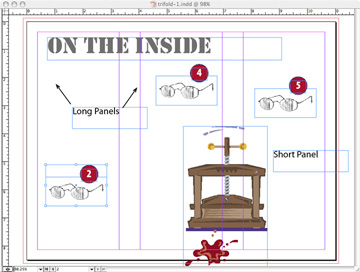
Now take a few more measurements into consideration, beginning with the front panel of the brochure.

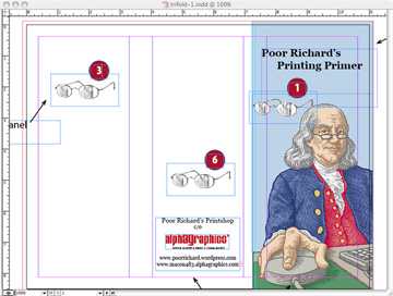
As you begin your layout, you must decide whether you want the image to bleed. A bleed is when ink is actually printed beyond the finished edge of the paper. If you choose this feature, oversized paper will be required. The bleed is achieved by cutting into the printed area. Your printer will require that the images that bleed extend 1/8″ past the finished page size. If you are working with a good page layout program, like Adobe Indesign, you can define the bleed in your document settings.

Remember that you must send the oversized image to your printer. If you send a native page layout file, the information will be there. On the other hand, if you save to a .pdf file, you must specify the final size of the piece including the bleeds. In this case, the final size would be 8.75 x 11.25.

Poor Richard’s Tips:

  • As you begin the layout, you may also want to make one slight modification to the panels that will help your printer greatly and make the finished product look more professional. In the image above, the leftmost panel folds in to make the trifold. Because of very small variations in both paper size throughout a print run and the tolerances of mechanical folders, it is necessary to shorten the fold-in panel by a very small amount. Usually 1/16″ is plenty. The two rightmost panels should be slightly longer and the leftmost panel slightly shorter.
  • If colors change from one panel to the next, it’s also good to determine where the overlap will occur. Remember that the fold line falls in the middle of the gutter lines. The blue screen behind Ben in the layout above actually laps over to the back panel by just a small amount. It will look better to have a small stripe of blue on the back panel than to have a stripe of white on the front of the brochure. If you are concerned about the folds, ask your printer for a blueline or a folding dummy before proof approval.

Step 3: Consider the Reader

It’s a common mistake to design a folding brochure on a flat sheet with the assumption that the reader will treat it like a letter. Remember that a trifold is folded. It won’t be read left to right and top to bottom. Rather, it will be unfolded and read panel by panel. Follow Ben’s glasses below:

readingorder1.jpg

readingorder2.jpg

Panel one, the front panel, will of course be the first one that the reader sees. He may actually turn the brochure and look at the back panel next, but it is more likely that he will open the brochure next. The second panel he will see is the inside left panel, followed by (Surprise!) the outside left panel, which is folded in next to the inside left. If your brochure is text heavy, your message should carry from the inside left panel to the outside left then to the remaining inside panels. If your brochure is heavy on art or photos, make sure that colors or photos on the inside left panel doesn’t conflict with the outside fold-in. And remember that if you use a photo or text that bridges the left two panels on the inside, part of it will be covered up by the fold-in.

Poor Richard’s Tip:

  • You can use the center and right hand panels on the inside as a single layout area. In the illustration above, Ben’s printing press falls in the gutter between the two panels. This is a great place for diagrams, illustrations or a large photo.

Step Four: Finishing Up

In the illustration above, panel #6 is the outside center panel. This is the back panel of the folded brochure. This is the place for contact information, directions, a map, or a final photo. This panel will probably get the least attention from your reader, so put the most important information somewhere else.

Poor Richard’s Tip:

  • You can design your trifold as a self mailer. If so, the back panel should be your address panel. Remember that the USPS will require a gummed tab to seal the brochure to receive automation rates. If the tab can be placed at the top of the panel, only one is required. If you orient the address so that the return address is at the open end (bottom left of the panel), you’ll save a little money and time when tabs are applied.

Last Words:

We missed the massive order for 200 trifolds. Not wanting to make too many assumptions about the art I’d received, I called the customer to ask the right questions. It was her cell phone. Her voice mail said, “Leave a message and I might call you back.” I did. She didn’t.